We create Colours
Twice a year, during Intercolor congress, delegates present their colour proposals for a specific season and the concepts, lifestyles and environments that influenced their choice. At the outcome of two days of discussion, the main trends are summarized and the intercolor colour range is drawn up, a distillation of the ideas shared during the work sessions.
While helping unify trends for the textile, fashion and design industries, Intercolor seeks to innovate and stay at the spearhead of the avant-garde. The Intercolor colour range is not governed by any preconceived rule or concept and can be translated into various types of colour card, giving a succinct forecast that closely reflects international trends and influences.
Colour cards are not published by Intercolor, but member countries are free to circulate the Intercolor consensus colour palette along with copies of the other member countries’ colour cards exclusively to their own organisations.
Colour Forecast
Colour ranges for 2025/2
IT'S NOT ABOUT I !
COMMUNITY ACTION
EMOTIONAL FOOTPRINT
HEALING CREATIVITY
HOPE IS NOT ENOUGH
Colour ranges for 2025/1
ON THE WAY / POLYPHONY / CONSCIOUSNESS / INTERSECTIONAL / COOPERATION / RESPONSIVENESS / IMPACT OF CHOICE
Colour ranges for 2024/2
SYMBIOCENE
Colour ranges for 2024/1
THE ART OF TOGETHERNESS AS A GLOBAL SURVIVAL STRATEGY
Interlacing Times
Interlacing Times evokes the convergence of the modern and the ancient as if we opened a time capsule of the past or the distant future. Colours express a certain spirit of inner luminosity – a holistic zest.
Living Layers
The soft contrast of the colour group plays on tomes that seem to be altered and evolved by time. They evoke material memories. Shades are treated like fleeting organisms; remains. Colours seem to both blend and contrast like in sfumato finishes.
Blue Mission
The colour combination is balanced and inspired by complementary minerals. They appear very tangible as if they marked a moment of solid change. The title Blue Mission evokes a movement of universal purpose.
Grotto
Grotto is a natural or artificial cave giving shelter, a simultaneous presence of pleasant and unpleasant. A dark place.
Unheimlich
Unheimlich literary means uncanny, a psychological experience of something horrible, but in a weird way very familiar. It places us in the field where we may not distinguish pleasure from unpleasure.
Threat
What is threating and what is threatened? Beauty in sadness, melancholy and in decay.
Sing a Song
We can leverage beauty and a human dreamality that can intuitively shape our actions.
Look Closer
Actions that can amplify and liberate creativity, respecting mindfulness, and our emotional intimacy with landscapes, and the human condition.
Tactile Playfulness
Art is the catalyst that fuels and floods invention and to be human is to make art.
Spectrum
White as an experimental space
Rich in oxygen
Sensible combination of new neutral and tinted tones to express intimacy, trust, harmonious movement, wellbeing.
Breath
Sensible combination of new neutral and tinted tones to express intimacy, trust, harmonious movement, wellbeing.
Stillness
A peaceful illustration of the flexibility of the colours mixing cold-worm, light-dark, matt-shinny, neutral-tinted.
Evernescent
A peaceful illustration of the flexibility of the colours mixing cold-worm, light-dark, matt-shinny, neutral-tinted.
Hyper-Personalisation
A hybrid world between the physical and the digital, characterized by the presence of a positive, captivating and enveloping darkness with a sharp blast of solar orange.
Embracing Otherness
A hybrid world between the physical and the digital
Kaleidoscopic Vision
A hybrid world between the physical and the digital, characterized by the presence of a positive, captivating and enveloping darkness with a sharp blast of solar orange.
Omni
A Multi-world between the physical and the digital
Synergy
Synergies of communication that are engaging and suggestive.
Positive darks - light glows out of darkness exposing new evolving and provocative hybrid possibilities.
Equilibrium
It is the balance that occurs in the pluriverse.
Searching for spiritual meaning in an unstable digital universe.
Tech shades balancing colours of the earth - mineral hues
Colour ranges for Autumn/Winter 2023/24
I AM BECAUSE YOU ARE
radical present - interwoven communities - blended realities - ethical activator - dialogue with nature
ARE YOU READY?!
traditional hip - pop spirit - augmented dissonance - life fantasy - it’s a good day - make smile - creative courage - pattern & random - sweetly loud - pretty but subversive

OUT OF CONTROL
everyday decadent - anger - hysteria - sticky baroque - arrogance - vandal-uxury - don’t fuck up

LIFE LOOPING
ongoing - beauty of decay - material honesty - colours with countless lifetimes - do look back - layers of wisdom

QUIET SOLUTIONS
future bacte_real - elementary energy - the power of fragile - the planeteers - bioengineering - creative science

UNKNOWN POTENTIAL
THE UNSEEN - MYSTICAL - MAGICAL SERENITY - ALIEN EARTHLING - BLUR - FILTER ACTIVATORS - GLOWING LUMINOUSITY - METALLIC EFFECT

© INTERCOLOR - All rights reserved
Colour ranges for Spring / Summer 2023
HOPETIMISM
NON-DOMINATION / INSPIRE PEOPLE TO CHANGE THEIR HABITS /
REBEL FOR JOY / POLY-NATION
SINGULAR US
Water spoke to me / Awakening our senses / Meditative Community / Force for life / YOUniverse / Inner Voyage / Flow of body and mind / Synergy with the universe / Back to ourselves

JOYOLOGY
Curiosity / Free mind / Universal Indie / Avant Garden / Innocent Wisdom / Viva La Vida / Free Association / Kawaii

IMITATED REALITY
Artificial Touch / Exaggerated radiance / Crypto tones / Intangible Phenomena / Cyber Romanticism / Virtual emotions

SIDEREAL
circumvolutory / regenerative / COSMOS / written in the STARS / KNOWLEGE of UNLEARNING / wise hands / open mind / PLANETARY / LOOP / tactile

PLEASURE IN FRUGALITÉ
ECO-HEDONISM / LESS IS ENOUGH / GUSTATIVE COLOURS / WARM RADIANCE / GROWING SIMPLICITY / PLEASURE OF LESS / ADJUSTED COMFORT

© INTERCOLOR - All rights reserved
Former Colour Ranges
A selection of some emblematic colour ranges
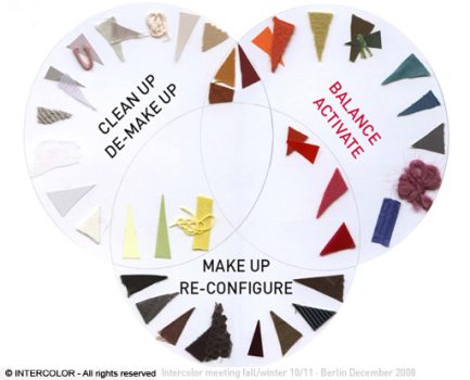
Fall / Winter 2010
The world continues to face a difficult time financially, with complex economic systems developed that intertwine with our daily lives. The Virtual is now Real. Ecology issues have become global problems and we need to act. It's time to reset things and to reconstruct and renew our real life.
"Make up - Clean up - Balance" shows the idea of designing colours on “Tabula Rasa”.
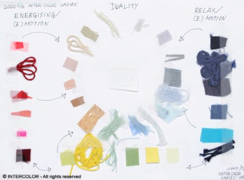
Spring / Summer 2000
White in the centre of this colour card symbolises the new millennium and the beginning of a new era, while yellow represents the importance of light.
The contradictory attitude between energising and relaxing is the key concept of the colour card.
Spring / Summer 1991
"Ecology" colour trends gained more power in the market. Natural motifs such as flowers, plants, water and sky inspired colours for fashion.
Tender ecological colours went well with colours borrowed from nature.
Fall / Winter 1987
Black & White (especially Black) played an important role in the market in the mid 80s. Japanese "Zen" colours or blacks had strong influence through designers Yoji Yamamoto and Rei Kawakubo, which is clearly evident in this palette.
At the same time, the new "Ecology" concept began to cast its shadow on the palette, symbolized by the ranges of browns, beiges and greens.
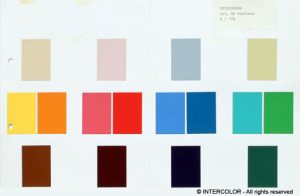
Spring / Summer 1979
Minimalism, Simplism and Health-conscious living gained ground in the late 70s. This palette shows it very clearly in the slightly tinted colours which symbolize the trend to these movements in the market.
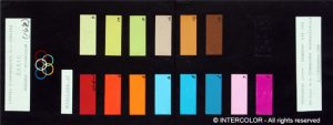
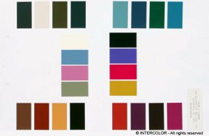
Spring / Summer 1968
This palette has the typical 60s vivid sporty atmosphere which was selected for 1968, the year of the Mexico Olympic Games. It shows the characteristic strong luminous colours which became popular in late 60s and peaked in 1968.